Contents
Inside this book
Ten chapters, from what BonBon stands for to the files you hand a printer.
Chapter one
Brand essence
Four words from the client brief. Every design decision in this book should serve at least one of them and contradict none.
Exclusivity
A room you are admitted to. Expressed through the threshold: frames, doors, arches, the monogram.
Discretion
Say less. Small marks, generous margins, no superlatives, nothing that shouts from the street.
Luxury
Material honesty: foil, brass, velvet, heavy stock. Gold is always treated as metal, never as yellow.
Sensuality
Implied, never shown. Carried by low light, texture, silhouette and the leopard's posture.
New York night club × Art Deco × luxury nightlife × esoteric sensuality
Character
What BonBon is, and isn't
- Dark, atmospheric, low-lit
- Gold-accented and rich in texture
- Private and composed
- Seductive through suggestion
- Heritage-minded, timeless
- Pastel, bright or soft-minimalist
- Playful, cute or cartoonish
- Neon, bevelled or glowing type
- Explicit, or priced next to a person
- Generic nightlife or startup styling
Chapter two
The logo suite
Primary · Logo 1
The crest
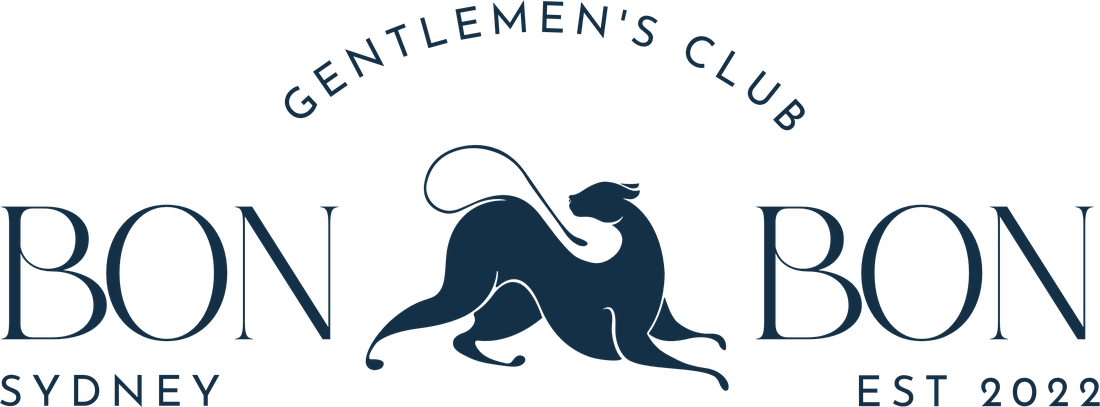
The leopard sits between BON and BON, with GENTLEMEN'S CLUB arched above and SYDNEY · EST 2022 set beneath. This is the full signature and the only lockup that names the venue type.
Use it where BonBon introduces itself in full: the website hero, menu covers, the launch reveal, letterhead and press.
Fixed parts
Leopard · BON BON wordmark · arched descriptor · SYDNEY / EST 2022 baseline. Never re-space, re-set or separate them.
Stacked · Logo 2
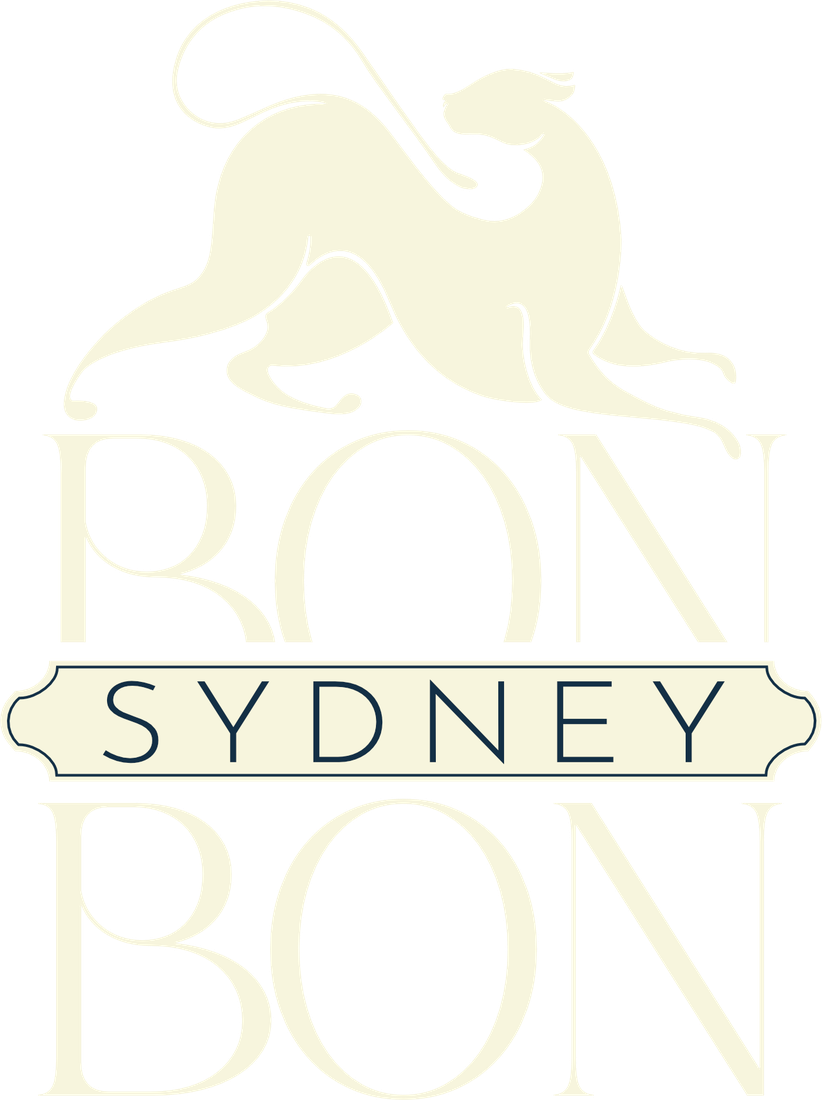
BON / SYDNEY / BON with the leopard on top and SYDNEY in a notched cartouche. Menus, posters, story frames, merchandise.
Centred · Logo 3
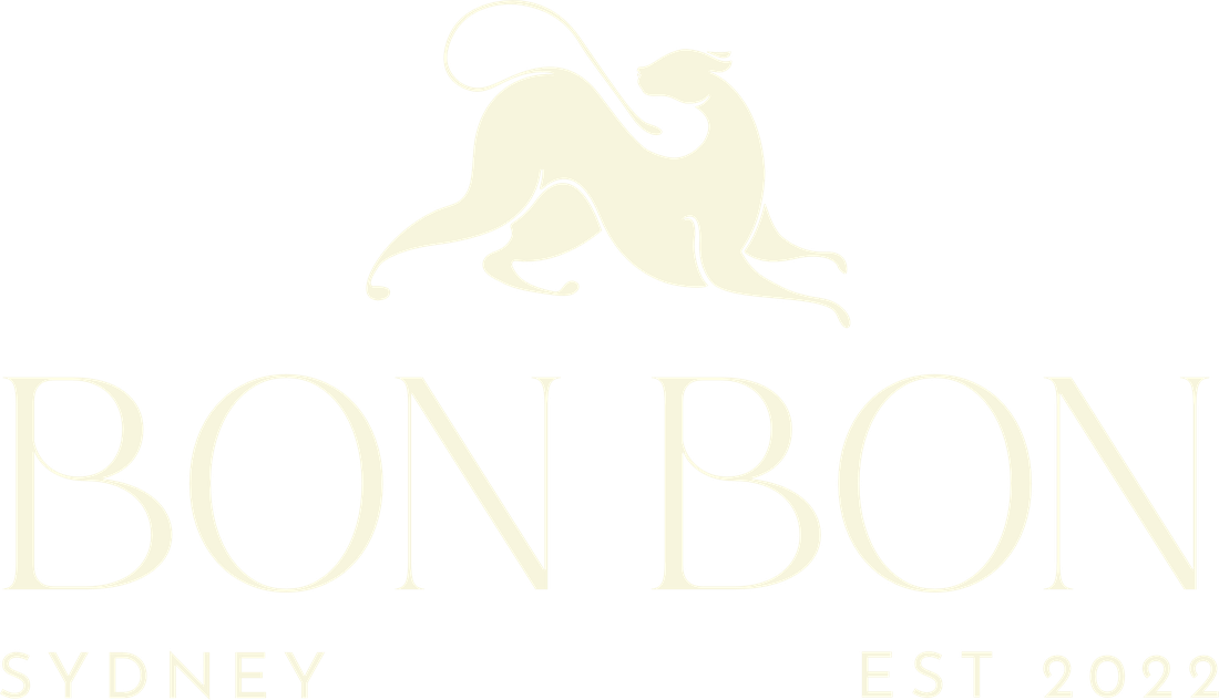
Leopard over BON BON with SYDNEY and EST 2022 beneath. The everyday lockup: business cards, social posts, square formats.

Horizontal · Logo 4
Leopard beside BONBON with SYDNEY tucked under. Website header, email signature, the door plaque, invoices.
Proprietary icon
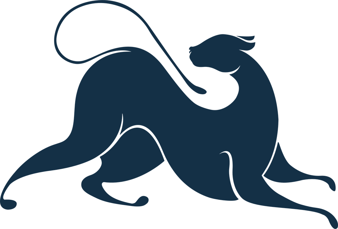
The leopard
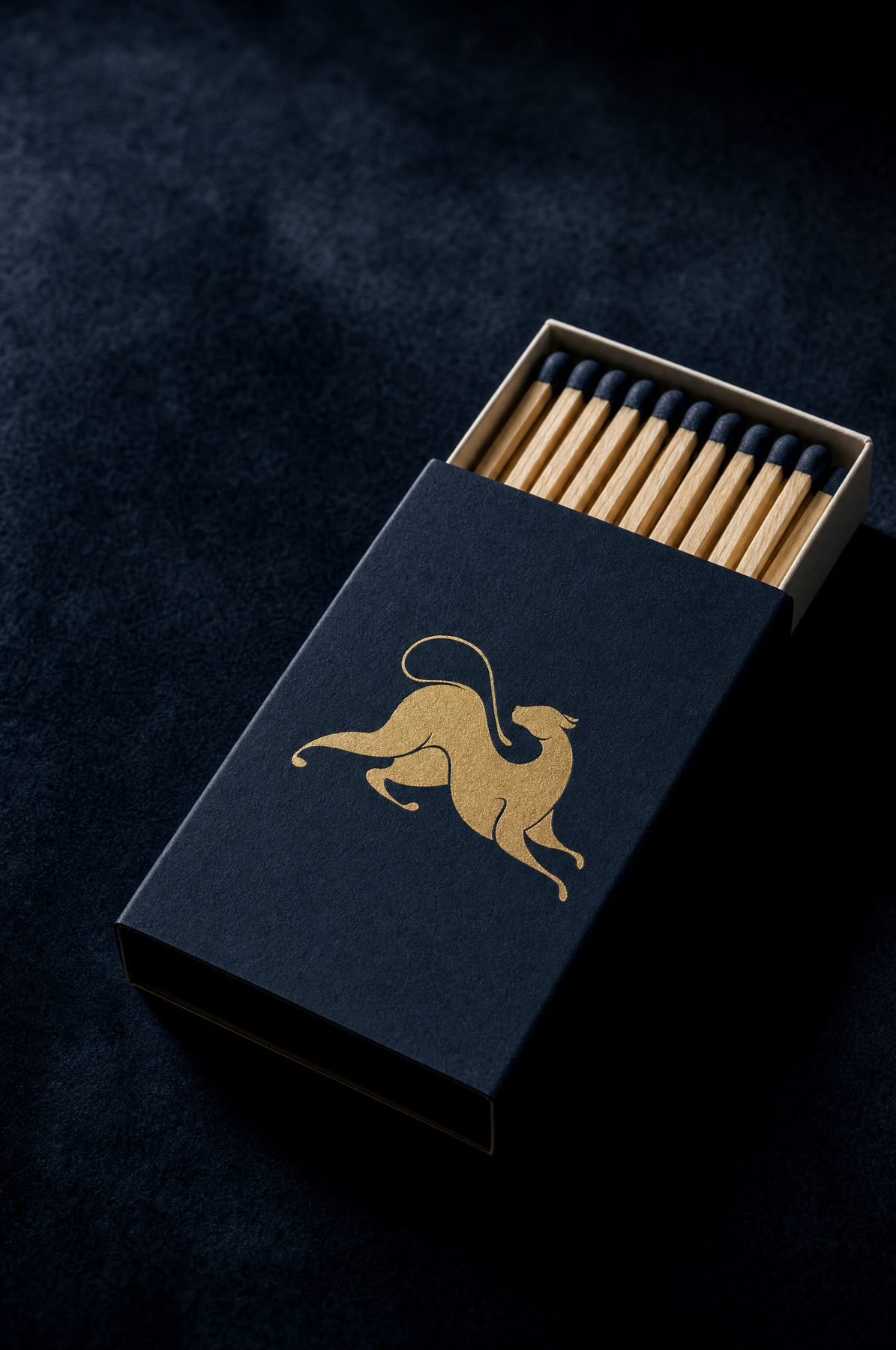
The stretching leopard with its long curled tail is the brand's ownable symbol: sensual through posture, never through anatomy. Use it alone once BonBon is already named nearby: coasters, matchboxes, deboss, embroidery, the social sign-off, the favicon.
The tail's curl is the most fragile detail in the suite. Check it at 200% on every foil, deboss and embroidery proof.
Monogram
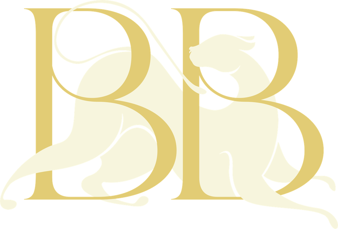
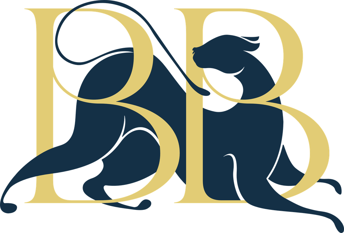
BB with the leopard
The two B's interlock with the leopard stretched through them. The most compact expression of the brand: avatars, seal stickers, gift cards, cufflinks and hardware.
Two builds, each made for one ground. Cream & gold for navy, onyx and dark photography. Navy & gold for ivory and paper only.
Choosing a lockup
Pick by the space, then by familiarity
The more of BonBon a viewer has already seen, the less of the logo they need.
| Context | Use | Avoid |
|---|---|---|
| Website header | Horizontal (4) | Stacked (2) |
| Website hero, menu cover | Crest (1) | Icon alone |
| Business card front | Centred (3) | Horizontal |
| Poster, story frame | Stacked (2) | Horizontal |
| Instagram avatar | Monogram, cream & gold | Logos with small text |
| Social post sign-off | Leopard icon | Crest |
| Street sign (600mm max) | Horizontal (4) | Crest (names venue type) |
| Favicon | Leopard icon, 48px+ | Monogram below 32px |
Chapter three
Using the logo
Clear space
X equals the height of the B in BON
Keep at least X of empty space on every side of any lockup. For the leopard icon and the monogram, X is one quarter of the mark's height. The tail counts as part of the mark.

Minimum size
| Lockup | Screen | |
|---|---|---|
| Crest (1) | 45 mm wide | 220 px |
| Stacked (2) | 25 mm high | 120 px |
| Centred (3) | 35 mm wide | 160 px |
| Horizontal (4) | 40 mm wide | 180 px |
| Leopard icon | 15 mm wide | 48 px |
| Monogram | 12 mm wide | 40 px |
Proposed values. Confirm against a printed proof, especially the leopard's tail in foil.
Approved colourways
Gold, Blue and Cream builds
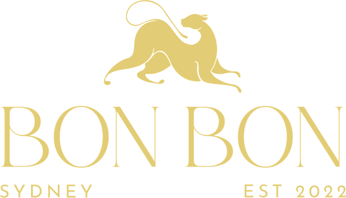
Default. Digital, foil on navy stock.
Night scenes, black editions.
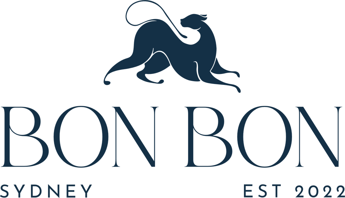
Paper, letterpress, documents.
One-colour print, embroidery.
Gold may sit on burgundy for a single hero piece. Never use Blue on navy or onyx, and never set a logo over a photograph without a dark scrim of at least 60%.
Never
Scale proportionally, always.
Gold, Blue or Cream only.
Gold is foil, not a light source.
Use the supplied artwork only.
ADULT ENTERTAINMENTOnly Gentlemen's Club, Sydney, Est 2022.
Logos sit level.
No pattern or photo behind a logo.
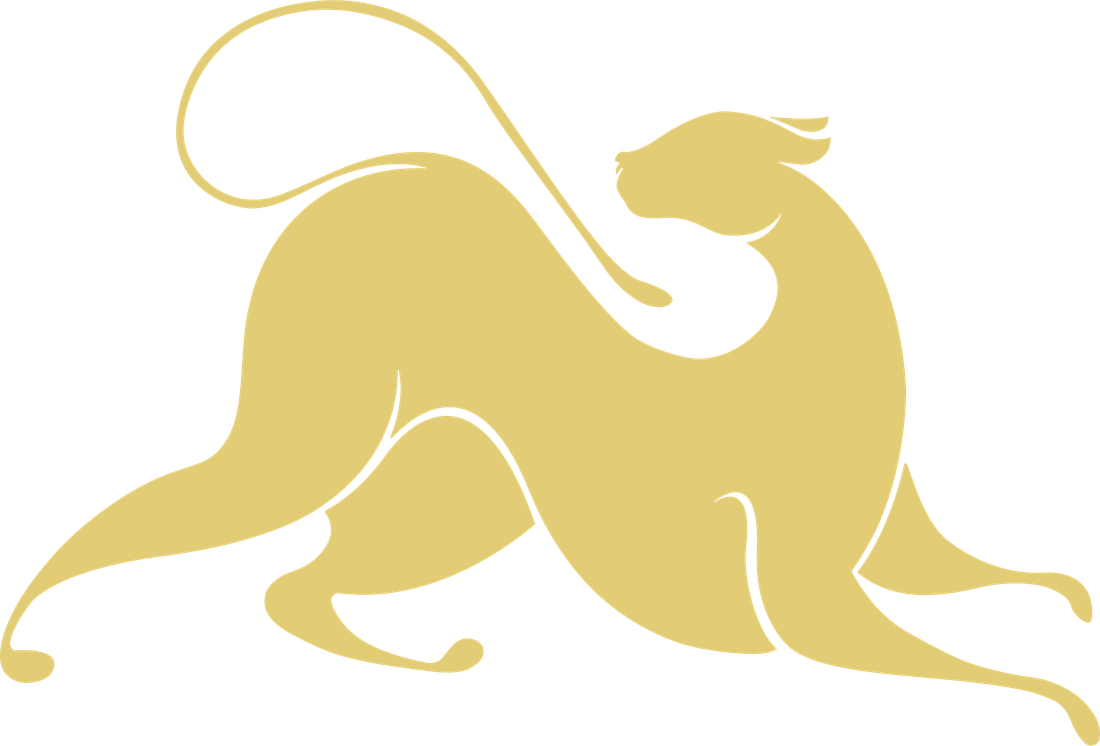
Keep the tail and paws whole.
Chapter four
Colour
Click any colour to copy its hex value.
Proportion · 60 · 30 · 10
Gold is powerful because it is scarce. If a layout looks gold, there is too much gold.
The gold gradient
On screen, large gold surfaces use #9C7F3A → #E2CC75 → #F6E9B4 → #E2CC75 → #A88A40 so they read as foil. In print, gold is real foil, never CMYK yellow.
The blue gradient
The website's section ground: #172B40 → #132233 → #0C1219 at 165°, light falling from the top left into near-black. Use it behind full sections, never behind small type panels or logos on their own.
Accessible pairings · WCAG contrast
Pairings that pass
All five pass WCAG AAA for body text. Never set gold text or a gold-only logo on ivory (1.5:1). The Blue & Gold monogram is the exception, because its navy leopard carries the mark.
Chapter five
Typography
Logo typefaces · Artwork only
Gefina & Josefin Sans
Gefina draws the BON BON wordmark; Josefin Sans, widely tracked, sets SYDNEY, EST 2022 and GENTLEMEN'S CLUB. Both live inside the logo artwork only. Never type the wordmark or descriptors in a layout.
Headlines, pull quotes, menu titles, numerals. Light 300 for display, Regular 400 below 24pt. Italic for emphasis inside a headline.
A signature, not a voice. One short phrase per layout, 20pt or larger, never in capitals.
Eyebrows, navigation, buttons, table headers. Medium 500, caps, tracked +200 to +300.
Doors open at eight. The bar is led by our head bartender, and private rooms can be reserved for groups of eight or more.
Running text, forms, captions, menus. Light 300 on dark grounds; Regular 400 on ivory.
Type scale
| Role | Sample | Face | Size / leading |
|---|---|---|---|
| Display | The Venue | Cormorant 300 | 56–120 pt / 0.95 |
| H1 | The Bar | Cormorant 300 | 36 pt / 1.08 |
| H2 | What's On | Cormorant 400 | 26 pt / 1.15 |
| Label | Reserve a booth | Montserrat 500 | 7–9 pt / 1.3 |
| Body | Arrive by nine for the first act. | Jost 300 | 9.5–11 pt / 1.5 |
Chapter six
Graphic language
Echoes the crest's arched line.
From the stacked logo's SYDNEY plate.
Holds the monogram on seals.
Frames photography.
Hairline cross in the corners of photos and frames. One to three per layout.
Coasters, loaders, deboss.
Client feedback after round two: double lines, arches and stars work, but heavy line work read "more pub than high end". The system is drawn in hairlines and starts from the logo itself.
Line rules
Precision in detail
| Property | Screen | |
|---|---|---|
| Outer line | 0.75 pt | 1 px |
| Inner line | 0.35 pt | 1 px · 45% |
| Gap | 2 mm | 6–8 px |
| Notch radius | 8% short side | 8% short side |
| Colour | Gold foil | #E2CC75 |
Pattern system
Patterns sit behind content at low contrast. Never put a logo directly on a pattern without a solid cartouche beneath it.
Chapter seven
Photography & imagery
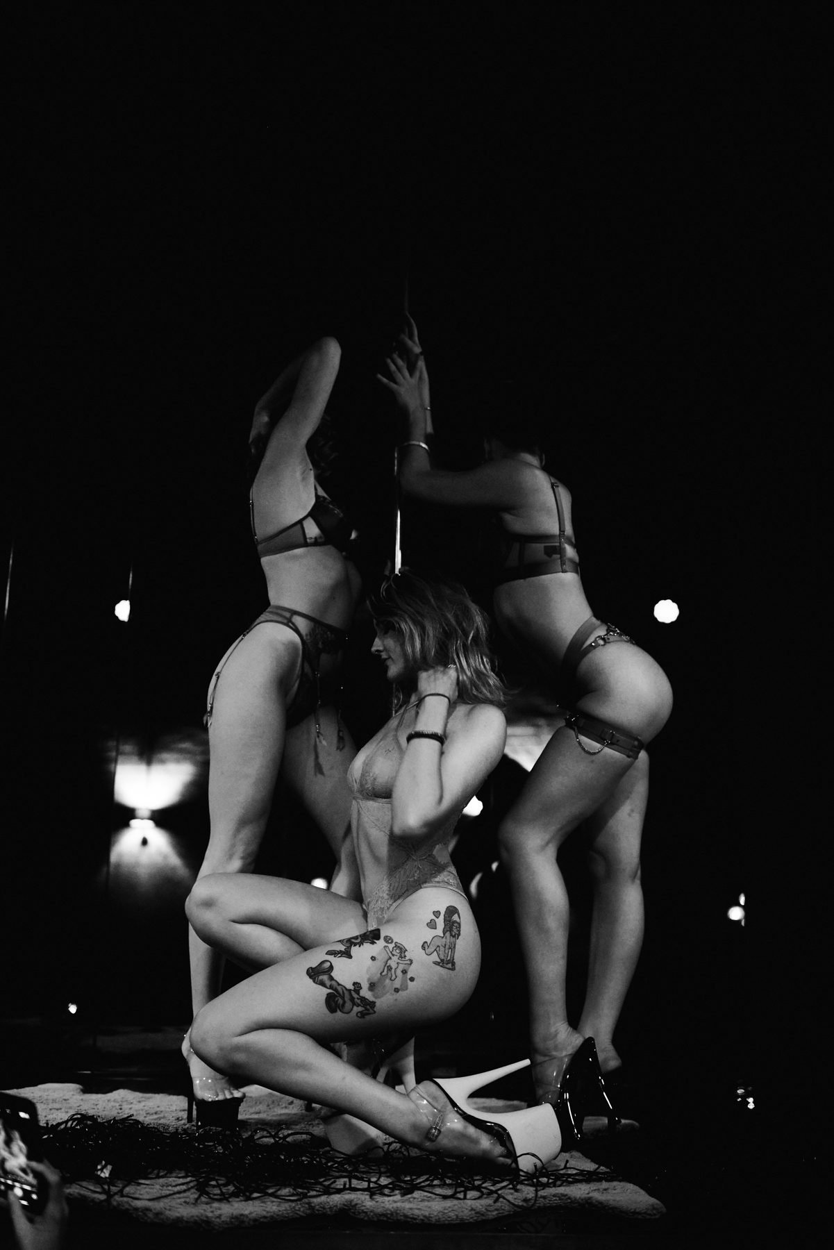
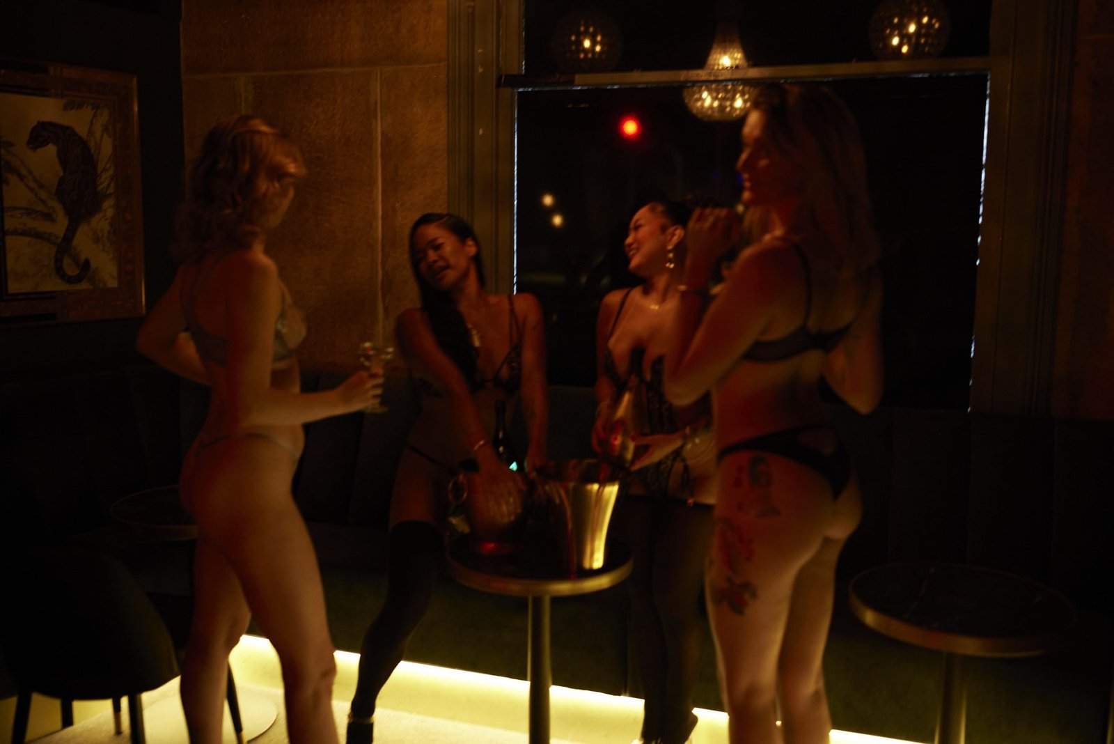
- One light source, falling into deep shadow
- Warm key from brass lamps or under-glow
- Or harsh flash on crystal and brass
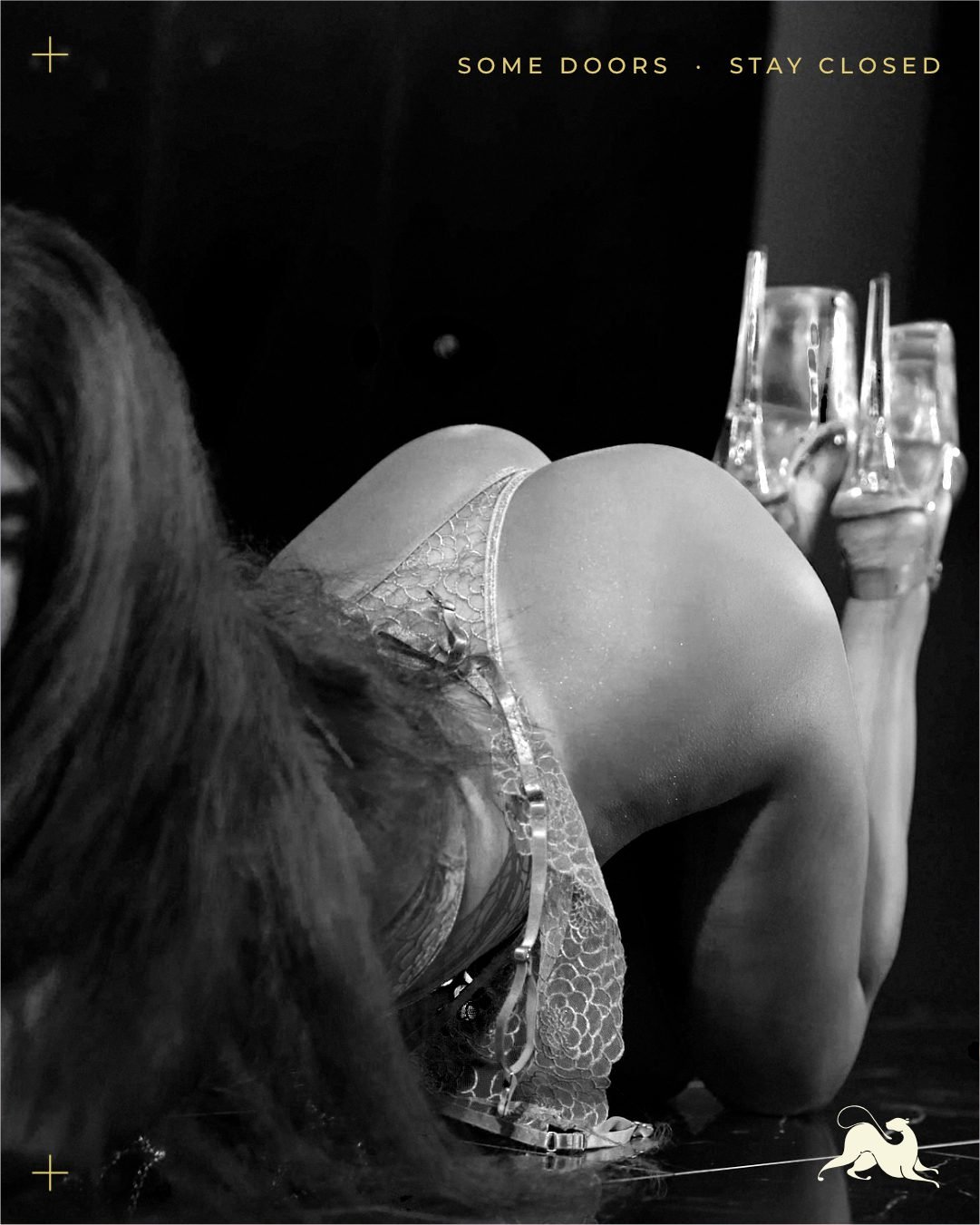
- Never flat or evenly lit
- The empty room before service
- Hands, glassware, gloves, fabric
- Performers as artists: silhouette, motion, profile
- Real BonBon furniture
- Nudity or body-focused poses
- A price, number or "DM" beside a person
- Props the venue doesn't have
- Watermarks or AI lettering
Colour grade · Paste into every brief and prompt
Colour: near-black and charcoal shadows, warm brass and antique gold highlights, deep violet velvet, soft magenta and violet accent light, bottle-green botanical tones, warm amber glow. Shot on 35mm film, visible grain, subtle halation.
Chapter eight
Voice & naming
BonBon speaks like a maître d': brief, warm, certain, never in a hurry. Saying less is the loudest position in this market.
Short sentences. No exclamation marks. No "best", "hottest" or "ultimate".
State, don't sell. The room, the drink and the production speak for themselves.
Clear about times, dress, pricing and booking. Discretion is a service.
Chapter nine
Applications
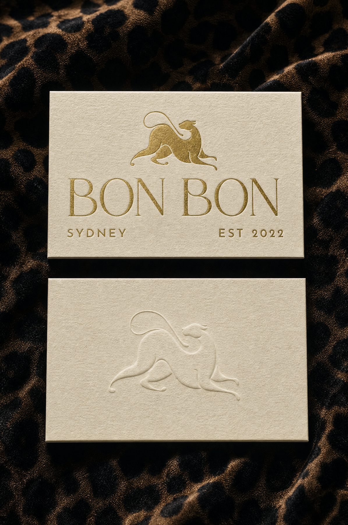
Ivory 700gsm cotton, centred logo in Blue or gold foil. Reverse: leopard blind-debossed.
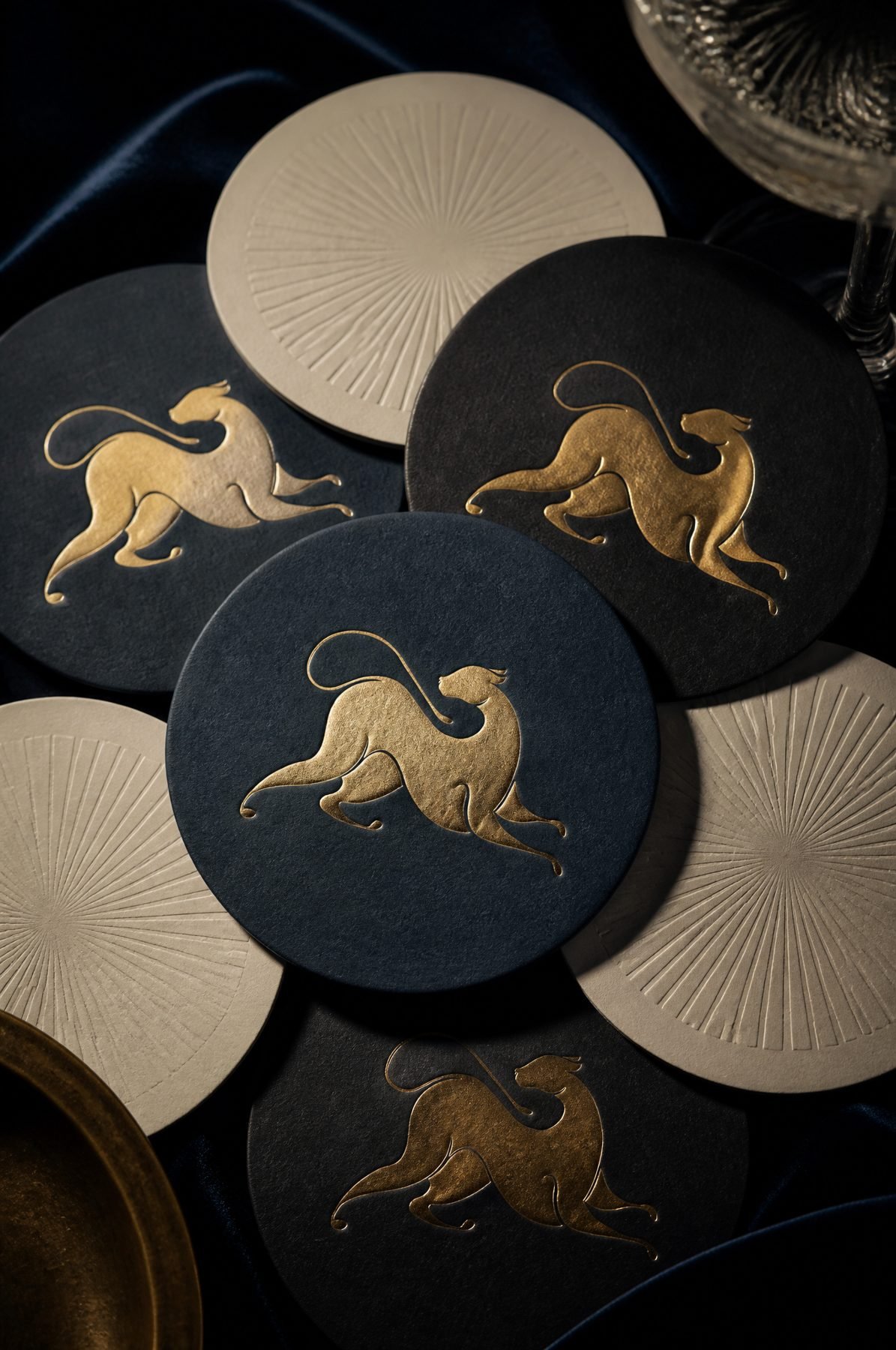
Navy and onyx with the gold-foil leopard; ivory with a debossed sunburst.
Aged brass, horizontal logo engraved. Name only, unlit, 600mm maximum.
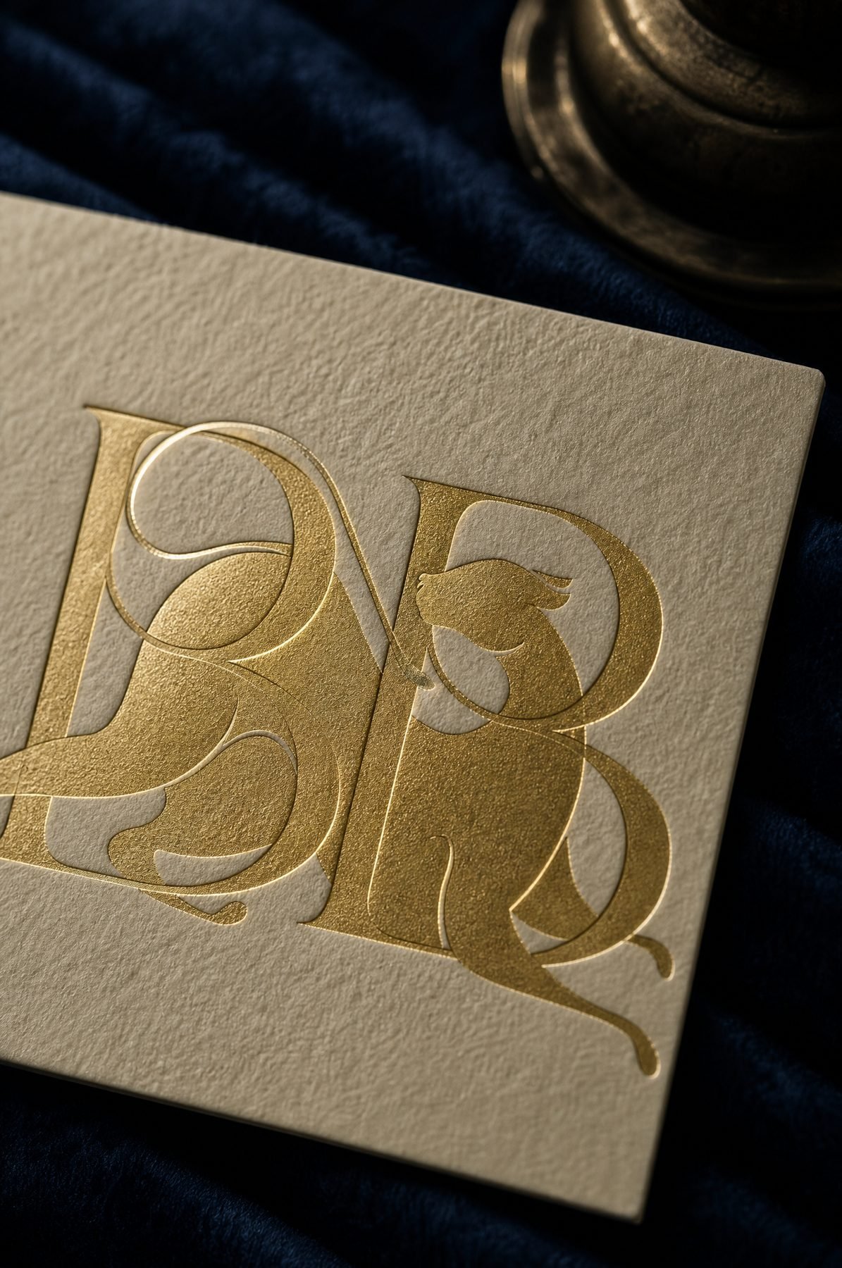
Monogram inside the arch. Posts sign off with the leopard.
Chapter ten
Files & contacts
Always use the master files. SVG and PDF files for print, web or Canva must have type converted to outlines.
- Logo 1 · Crest
- Logo 2 · Stacked
- Logo 3 · Centred
- Logo 4 · Horizontal
- Icon · Leopard
- Monogram · BB
- SVG · web, Figma, print
- PNG transparent · email, social
- Gold · Blue · Cream per logo
- Monogram: Cream & Gold, Blue & Gold
- Brand: Deb Young Studio
- hello@debyoungstudio.com
- Venue:
- hello@bonbonsydney.com.au
Layout photo usage
Instagram photo usage
Magazine luxury layout. Click a post to see it full size.
 6 Bridge Street · Sydney